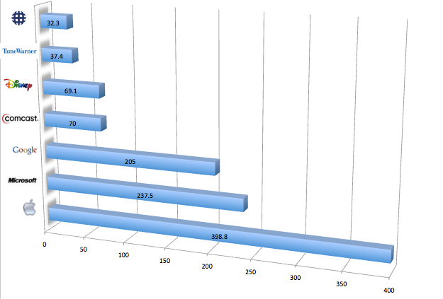
This chart illustrates the market capitalization of 3 top tech companies and 4 top media companies. (In billions.)
If you add up the 4 media companies, they are roughly half the valuation of Apple. Even the largest of these media companies, Comcast, is less than half the valuation of the smallest, Google.
Need I do a trend chart, too?

2 responses
[…] the DMCA and cheered the DeCSS verdict had kept on getting their way in Washington. Never mind the larger size of the tech industry; at worst, Big Copyright might lose a round after an egregious overreach, but that setback would […]
I think you need several complementary charts … a. political contributions b. number of employees c. net profits … and number of customers might be interesting, but hard to get a meaningful measure.